NeighborTools - Borrowing Case Study
NeighborTools connects tool owners with renters on a safe, secure peer-to-peer sharing platform. Owners earn money from unused tools, while renters save money and support local communities by avoiding purchases. Here I focused on the borrowing task.
This is a concept project that I was working on while I was studying in UX-Land School. In a team of three we were assigned to design a website to facilitate the process of lending and borrowing tools among people.

Duration
Oct 2023 - Jan 2024
Team
Group of 3
Tools
Figma, Figjam, Photoshop & Canva, google Form
My Role
UX Research, UX Design, Interaction Design, Useability Testing
Business Need
Developing a user-friendly Peer-to-Peer platform that simplifies listing items and effortlessly locates nearby tools available for rent.
Goals
A key goal of our research was studying users to understand their concerns and needs.
Establish NeighborTools as a trustworthy app, making it easy for users to trust the platform.
Streamline the tool renting and borrowing journey.
Simplify the process for users to locate the nearest required tool.
Provide seamless navigation, particularly between lending and borrowing activities.
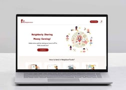
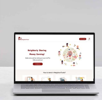
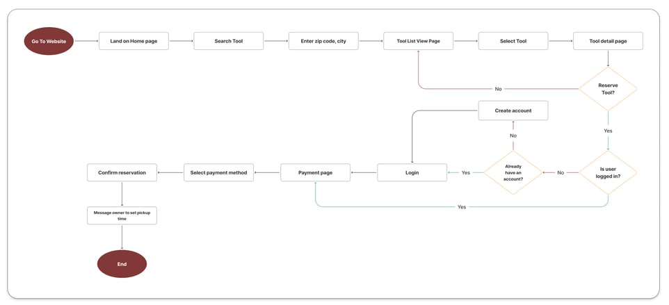
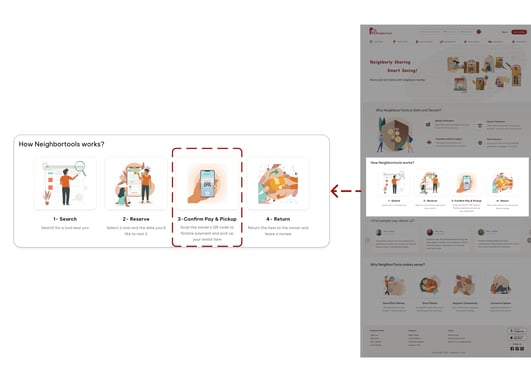
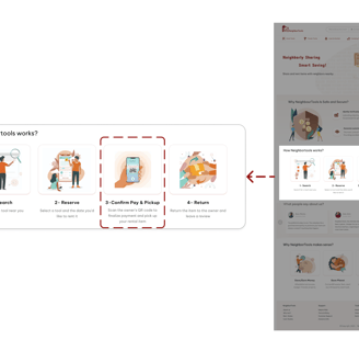
Final Prototype
THE SOLUTION
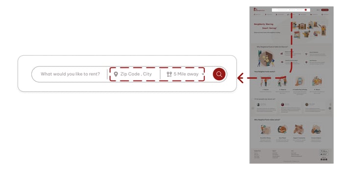
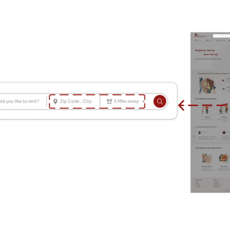
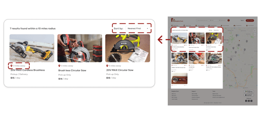
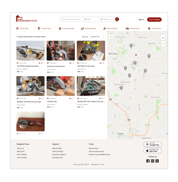
In the video below, you can observe the user flow for searching and borrowing a circular saw within a 7-mile distance.

But, how did we arrive at the final product?
Double diamond design process has been adopted for this project.


THE PROCESS
Discover
To understand users and problems, the following steps has been taken
Interviews
Competitive analyses
Surveys
To kickstart the project, we conducted a semi-structured interview with a group of 8 individuals to assess their willingness to lend and borrow tools. To find the interviewees I posted in our neighborhood Facebook group and asked if people are interested to do the interview. I aimed to identify their pain points and crucial factors involved in these processes by inquiring about their past experiences and preferred locations for borrowing tools.
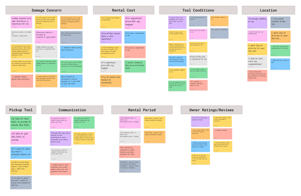

Takeaway
Concern about tools damage
Knowing about last condition or health of tools
Finding tools close to their location
Finding tools that fits their budget
Interview & Affinity Diagram
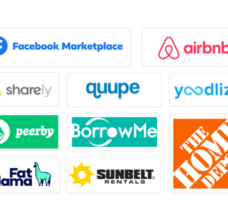
Facebook Marketplace, as a good customer-to-customer app, and Airbnb, as a successful app for sharing personal properties, along with eight other similar websites, were considered. By studying them, valuable lessons to improve the user experience of our product were learned. These insights have been used to enhance our information architecture and user flow.
Takeaway
Neighbortools needs to highlight its features like: search by distance and confirming tools before deducting money; Since most of our competitors don't offer these.
How to present these feature and have a seamless and smooth borrowing journey.

Competitive Analysis
Based on the result of the interviews and competitive analysis, an online survey with 8 questions was conducted to evaluate our findings. We received a total of 102 responses, of which 70% were between the age of 35 and 44.
Survey
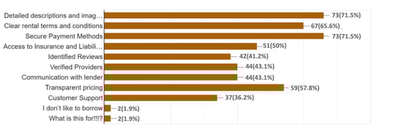
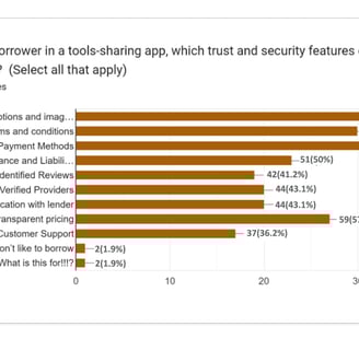
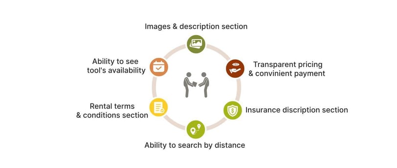
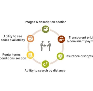
Important trust and security features identified for borrowing include:
Clear and updated images & description (72%)
Secure payment (72%)
Clear rental terms & conditions (65%)
Transparent pricing (59%)
Insurance & liability coverage (50%)
Takeaway
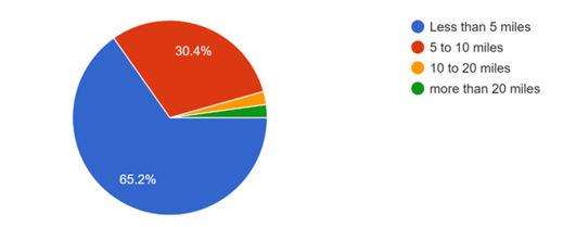
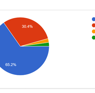
65.2% of responders preferred less than 5 miles traveling distance.
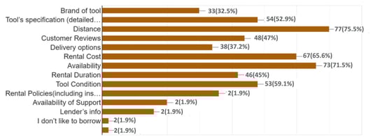
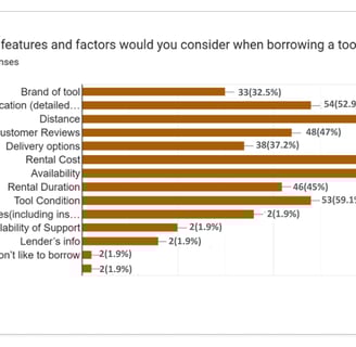
The most important factors in selecting a tool for borrowing
Distance (75.5%)
Availability (71.5%)
Rental cost (65.6%)
Tool condition (59.1%)
Tool's specification (52.9%)
Based on our survey, we should focus on the items below and make them easily accessible for users.
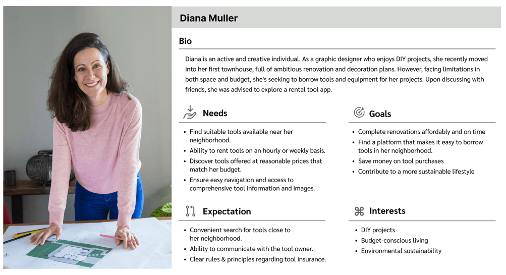
After conducting interviews, a user persona was identified for borrowing from NeighborTools: Diana Muller, who lives in an apartment and prioritizes space-saving and budgeting. A user flows for borrowing was developed after that.
Persona
User Flow

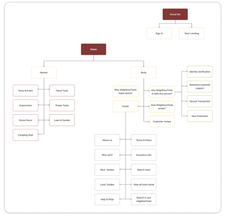
Site Map
Define
User flow was developed accordingly:
By doing card sorting, we learned how to organize different sections of our web site and we made first version of our site map. However through out the design process, user testing and the competitive analysis, the final version of the site map was build.
Challenge & Solutions
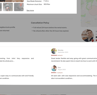
Uncertainty regarding Insurance and tool protection against potential damage or loss for both owner and lender.
Dedicate a section on the first page of our platform to highlight all insurance and item protection information.
Challenges
Solutions
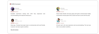
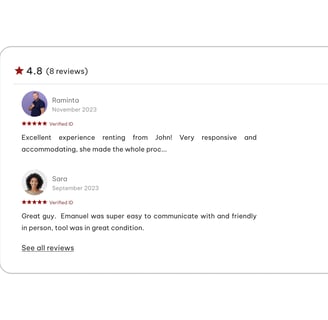
Implement a section on the first page of our platform showcasing user reviews and feedback about their rental experiences with our platform.
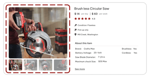
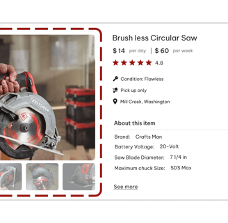
Encouraging owners to add high quality images and detail description regarding tool’s condition, this can include information about any wear and tear, which helps ensure that potential borrowers have a clear understanding of the tool's condition before making a decision.
Concerns about both the condition or health of the tool (specially power tools) and whether it matches the pictures provided.
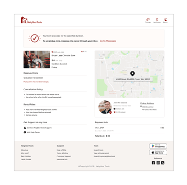
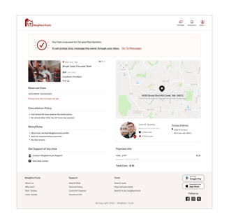
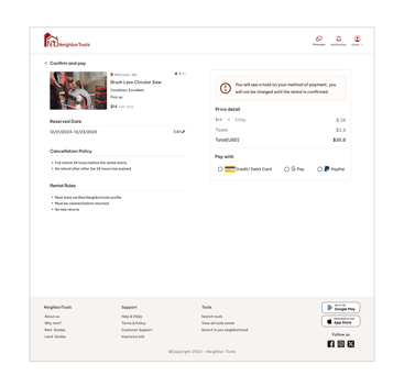
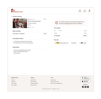
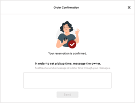
Emphasizing the confirmation system on the first page. Renters aren't charged until they receive and confirm the tool.
Introducing a rating and review system, enabling users to leave feedback after each rental. This fosters trust within the community and provides valuable insights for owners and renters alike.
Proximity and short travel is an important factor for borrowers.
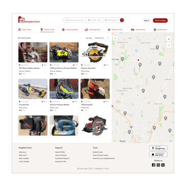
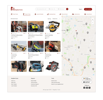
Implementing a "Search by Distance" feature, allowing users to set a desirable distance and find tools within that specified area.
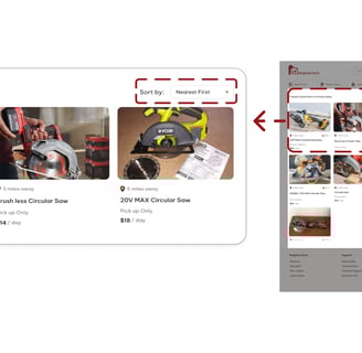
Sorting our search results to "Nearest First" by default and displaying the distance of each tool from the renter's current location.
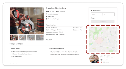
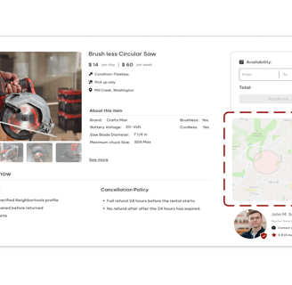
Showing the location of tools in the item detail page, helping renters quickly assess whether a tool is conveniently located for them.
Develop
After diving deep into all our research data and understanding users' needs and problems, we endeavored to figure out how we could respond to their concerns and address them by incorporating a solution into our design. Here are the possible solutions we came up with:


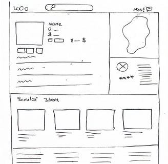
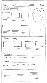
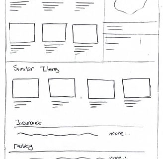
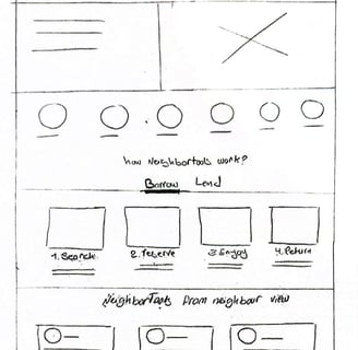
Sketches & Wire Framing
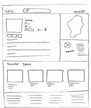
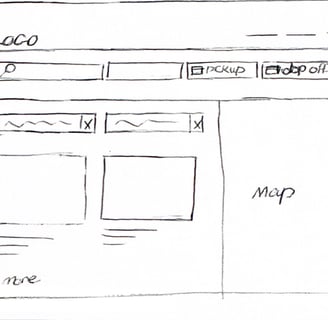
With the help of low-fidelity wireframing through hand sketching, we offer a quick and efficient method for exploring ideas and enhancing communication within the team.
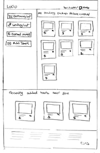
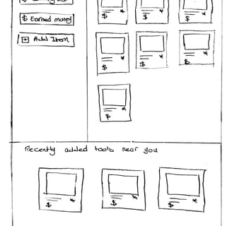
Low-Fidelity
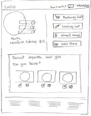
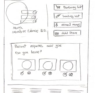
Mid-Fidelity
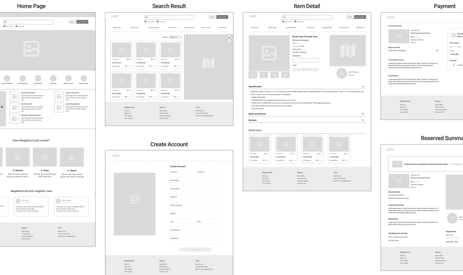

Usability Test (phase 1)
Home Page
Search Result
Item Detail
Payment
Create Account
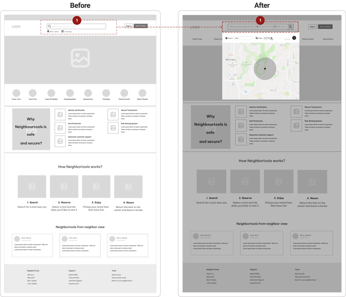
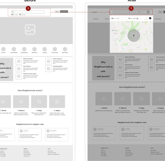
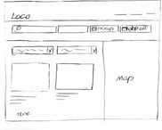
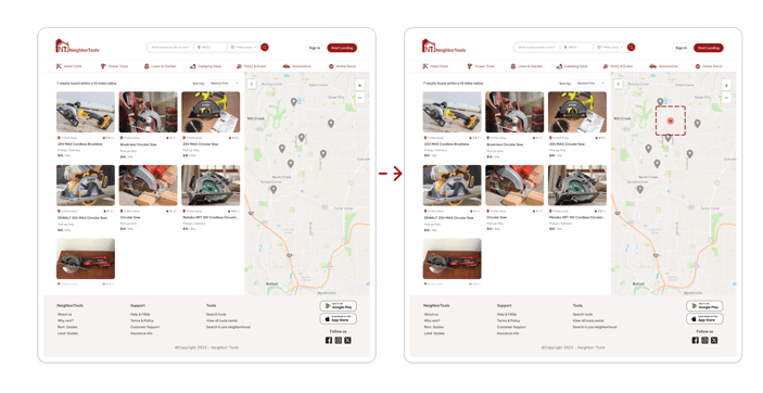
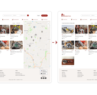
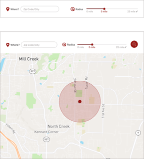
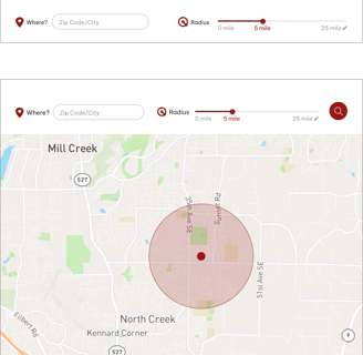
1- We observed that many users struggle to gauge distance, finding it challenging to understand measurements like 5 miles. As a solution, we redesigned our platform to include a map feature. Users can now visually define the radius they're searching within, rather than just entering a numerical distance.
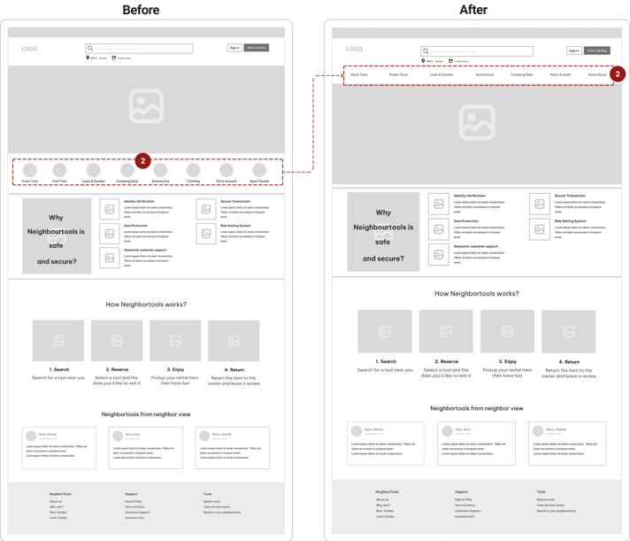
2- In our initial design, we observed that users couldn't immediately see the categories of items available for rent. To address this, we decided to incorporate the categories into our hero section, allowing users to quickly understand the range of items they can rent.
Before
After
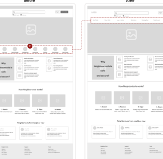
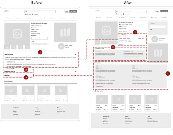
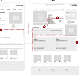
1, 2, 3. We replaced the accordion menu with dedicated sections for each piece of complementary information due to inconsistencies and slowed user interaction across different screen sizes.
Item Detail Page
1- We enhanced information presentation and adjusted the tool listing input form after observing users struggling with lengthy text to find tool information.
Home Page
What did our users think about our design?
We created Mid-fidelity wireframes on Figma to gather feedback, and iterate on designs before moving on to more detailed and refined stages of the design process.
Before
After
2- We replaced "Rules and Policies" with "Things to Know" to create a more inviting and user-friendly tone, conveying helpfulness rather than strictness.
Reserved Summary
Search page
Search page-Result
Tool's information page
Profile
Profile-Borrowing List
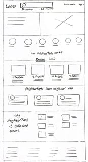
Home page
Before
After
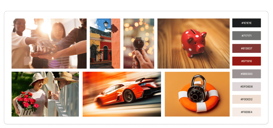
Mood board
UI-Kit
UI Design Direction
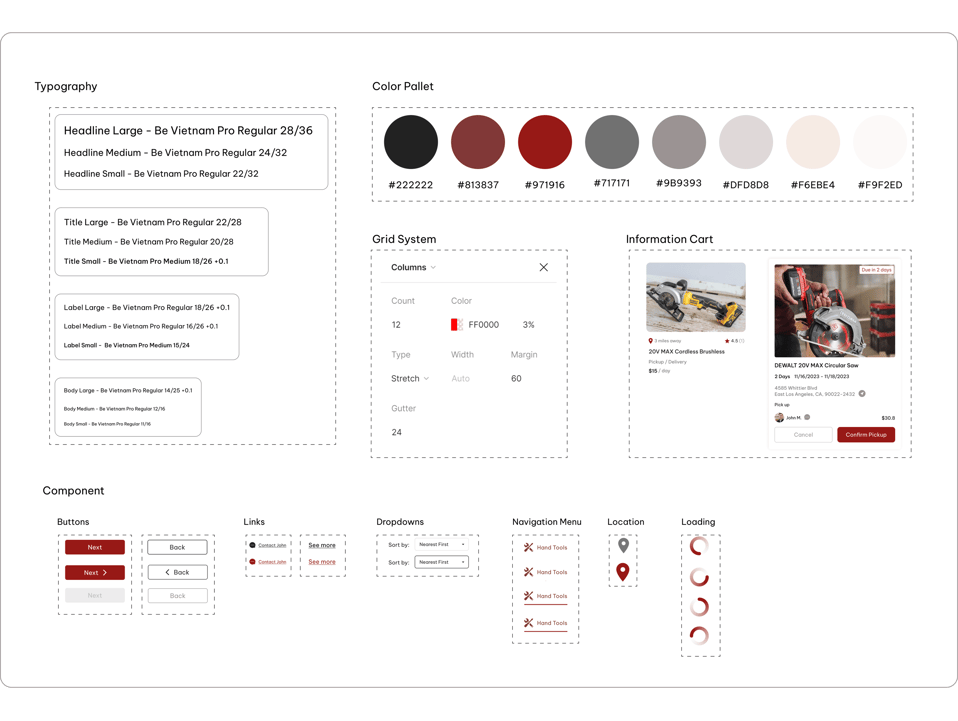
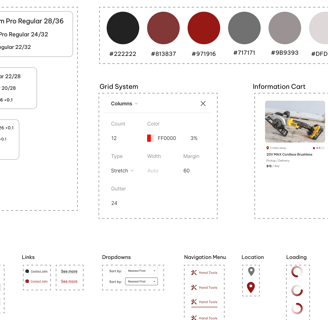
To design a high-fidelity interface for NeighbourTools, we start by creating a mood board that reflects the main goals and desired feelings as outlined by stakeholders. This helps us establish the visual direction and overall aesthetic for the interface.
Following mode board, we develop a UI kit, to ensure efficiency and consistency throughout the design process. We also did a color contrast test to check if our selected colors meet Web Accessibility standards.
Color Accessibility
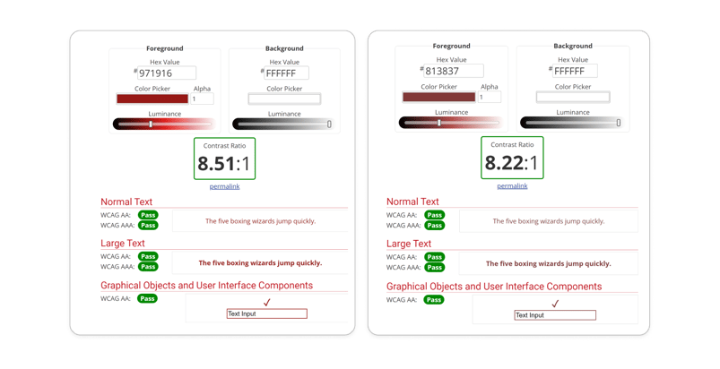
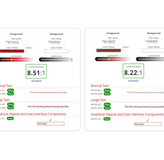
The contrast between the foreground and background colors of the primary and secondary buttons was tested on websites that evaluate color blindness, ensuring their acceptability.
Deliver
Usability Test (Phase 2)
We noticed that many users struggle to locate themselves on the map. To address this, we display the user's location as a blinking spot, making it easier for users to find themselves and understand distances on the map.
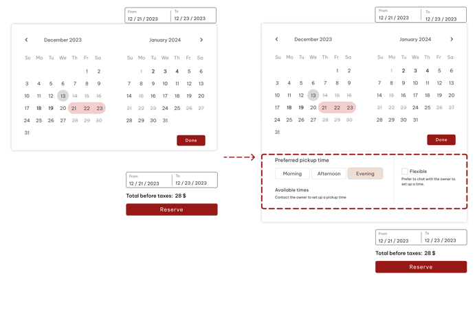
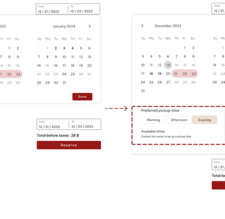
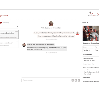
In Item detail page, when users wanted to set the borrowing duration and pickup date, they sought more precise timing options than just whole days. Therefore, we introduced preferred pickup times in three slots: Morning, Afternoon, and Evening, along with a Flexible option. Initially, lenders must select these time slots to make them available for users to choose.
Before
After
Before
After
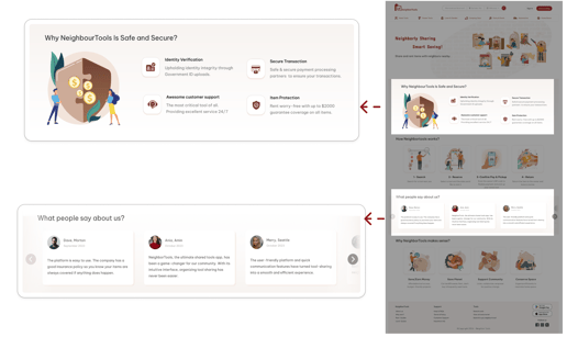
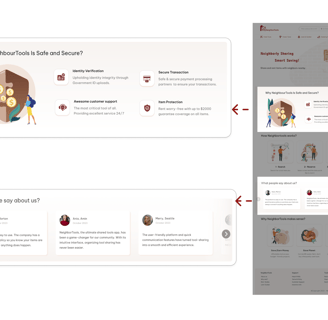
Delivered Design Pages
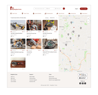
Home Page
Power Tools Page
Search Result Page
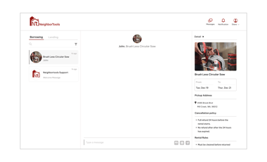
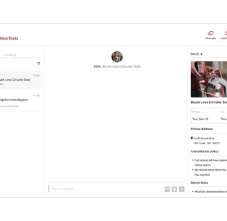

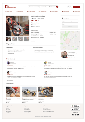
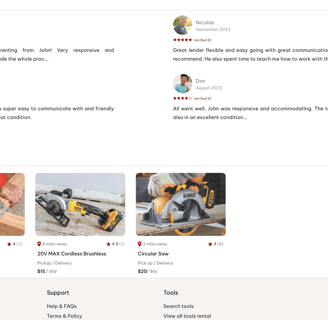
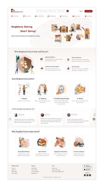

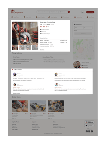
Item Detail Page
Check Out summary Page
Confirm & Pay Page
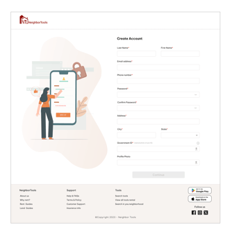
Create Account Page
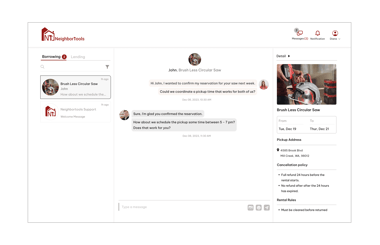
Inbox Page
Zip Code
Publish Confirmation

Prototype
Here is the last prototype, displaying what we've achieved through our design process.
Reflection
What did I learn?
Effective communication with team members and lead challenging situations
When designing, it's important to strike a balance between meeting users' needs and aligning with stakeholders' marketing strategies.
The project taught me a valuable lesson: instead of fixating on being right from the start, it's more crucial to embrace the iterative learning process and adapt as you go along.
What can we do next?
Finalizing the mobile version of platform.
Evaluate the current design by doing more user experience testing.
Think about the solution for the time when it comes to tools becoming outdated or less utilized over time.