Reader City App
Gamifying reading with rewards for milestones, enhancing motivation through social connections.

Reader City uses a user-friendly e-commerce app to promote reading habits through gamification. Users earn points by hitting short reading milestones, redeemable for rewards like music tracks and extra books. The app makes reading accessible anytime, anywhere, overcoming focus challenges with enticing rewards, ultimately leading to free books.
Our team of three freelancers is committed to designing an app that turns your free moments into reading opportunities. We promote social connections for easier access to reading material and motivation from friends' activities. As UX designers, our main aim is to ensure users can navigate smoothly and set goals easily.
PROJECT OVERVIEW
My Role
UX|UI Designer
Tools
Figma, Photoshop, Canva, google Form, Marvel
Team
Group of 3
Duration
4 weeks
Key Contribution
Project Management
User Research
Concept Ideation
Wireframing
Prototyping
Usability Testing
Interaction design

Final design first: a glimpse before the deep dive
DELIVER
Many individuals struggle to maintain consistent reading habits due to various challenges such as lack of motivation, difficulty in tracking progress, and limited social engagement around reading. Existing reading applications often fail to provide a holistic approach that combines goal-setting, habit formation, and social connectivity. As a result, readers find it hard to stay focused, motivated, and engaged in their reading activities.
PROBLEM STATEMENT
PROPOSED SOLUTION
Set Reading Goals for Easy-Win Points: Allow users to set achievable reading goals and earn points, fostering a sense of accomplishment.
Simple Reading Tracker: Provide an intuitive tool for tracking reading habits to help establish a routine.
Notifications and Breaks: Implement reminders and breaks to improve focus and reduce eye strain.
Social Engagement: Create a community for sharing reading experiences, recommending books, and engaging in discussions.
NOW, let’s uncover the journey to the final design
To understand how we could design a reading app to encourage users to use it regularly, we conducted surveys, interviews, and checked out our competitors.
It started with a survey
I conducted a survey to identify the main obstacles to reading books and to understand how people usually choose their books. A total of 113 people participated in our survey.
The insights revealed that:
The primary obstacle to using a reading app was time limitation.
Additionally, users found navigation in reading apps challenging.
Furthermore, friends play a significant role in helping users select books more easily.
DISCOVER
Follow-up interviews were conducted to gain deeper insights
Voices of The Potential Users
After analyzing the survey results, we conducted follow-up semi-structured interviews, with 15 participants, to better understand the potential users' pain points, needs, and preferences when it comes to reading books. We organized the information using affinity diagram, clustering user thoughts into distinct patterns.


"I need a simple reading tracker to keep up with my routine."


"I stay motivated when I can earn points easily & see progress."
"Maintaining focus during reading is a real challenge for me."
"Reading in a group and discussing the books really motivates me to read more."


THEN, I wondered how our competitors have addressed these challenges?
We studied 6 apps, including educational ones like Duolingo and communication apps like Clubhouse. We wanted to see what they do well and where they fall short. We examine their features and functionality, user experience flow, and content presentation and organization.


Research Insights
Key Takeaway
01
02
Rewarding users with easy-win points can greatly boost their motivation.
Friends play a significant role in helping users select books more easily.
To build a reading habit and motivate users, short-term goal setting integration is crucial.
Simplifying social engagement through group reading, live chatting, and seamless connections with friends can be highly motivating for users.
03
04

KEY TAKEAWAYS
Additionally, users found navigation in reading apps challenging.
Friends play a significant role in helping users select books more easily.
Research Insights


To build a reading habit and motivate users, short-term goal setting integration is crucial.
Rewarding users with easy-win points can greatly boost their motivation.
Simplifying social engagement through group reading, live chatting, and seamless connections with friends can be highly motivating for users.


Based on our research, we developed a persona: Sara Ketabi, a 38-year-old software engineer from Baltimore, MD. She loves her job and is passionate about reading but struggles to find time in her busy schedule to enjoy her favorite books. She feels that she needs more motivation to establish a consistent reading habit.


DEFINE
Step into the world of our readers
Here’s Sara’s journey with Reader City.


Storyboard
DEVELOP
How Might We ...
Connect users to share their thought about books and enhance social engagement?
Encourage users to develop a reading habit by rewarding reading?
Stay focused with the ability to block notifications from other apps, ensuring uninterrupted reading time, along with break reminders to keep you refreshed?
01
02
03
Connecting users to discuss books and boost social engagement:


Design Thinking


Encouraging users to build a reading habit with progress rewards:
Enhancing reading focus:
based on insights from our research and our understanding of the problem and user needs, we endeavored to develop user-centered solutions that not only address real user needs but also deliver a positive user experience.


After creating mid-fidelity wireframes, we tested them with users to assess their effectiveness. Based on the results, we iterated on some parts as shown below:
After usability testing, we discovered that users had difficulty finding the appropriate feature in the top navigation bar because it was crowded and contained too many features.
Placing the goal in the settings dropdown menu made it difficult for users to find. Moreover, it was confusing for them.


Before
After
Before
After

ITERATE
Design Evolution: Iterative Process (Round 1)
We moved it to the profile dropdown menu. Additionally, to reduce the time it takes to find it, we placed it in the hero space on the homepage.
Problem #1 :
Refine:
Problem #2 :
As a solution, we organized all the text interaction features into a dropdown menu.
Refine:
By implementing the results from usability test 1, we created high-fidelity wireframes, which we then tested with users. Based on their feedback, we made revisions to certain sections, as illustrated below:


Design Evolution: Iterative Process (Round 2)
Setting Screen:
Book Overview Screen:
Day-Streak Screen:
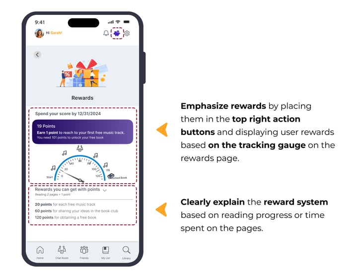
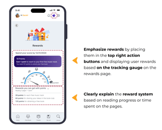
Reward Screen:
Design Process


Define
User Flow
Our user flow involved signing into the app, setting a goal, selecting desired content to read, and then reading the chosen book within the designated goal time.


To rapidly visualize the overall structure and layout of the ReaderCity app, we created these hand sketches. They enabled us to collaborate effectively and gather feedback from our team members.
Sketches & Wireframes


Utilize white and gray for readability and cleanliness, accentuated by pops of purple to highlight gaming and technology elements, and orange for notifications.
Mood Board


UI Design Direction
UI Kit


The contrast between the foreground and background colors of the primary and secondary buttons was tested on websites that evaluate color blindness, ensuring their acceptability.
Color Accessibility


With the assistance of mid-fidelity wireframes created in Marvel, we aim to clarify the functionality of ReaderCity, facilitate communication with stakeholders, and prepare the app for prototyping.
Mid-Fidelity


After creating mid-fidelity wireframes, we tested them with users to assess their effectiveness. Based on the results, we iterated on some parts as shown below:
Usability Test 1
After usability testing, we discovered that users had difficulty finding the appropriate feature in the top navigation bar because it was crowded and contained too many features. As a solution, we organized them into a dropdown menu.
Placing the goal in the settings dropdown menu made it difficult for users to find. Moreover, it was confusing for them. As a result, we moved it to the profile dropdown menu. Additionally, to reduce the time it takes to find it, we placed it in the hero space on the homepage.
Before
After
Before
After
By implementing the results from usability test 1, we created high-fidelity wireframes, which we then tested with users. Based on their feedback, we made revisions to certain sections, as illustrated below:
Usability Test 2
Users had difficulty finding 'My List'. Consequently, we relocated the Reward and 'My List' icons and removed "Go to My List" from the 'Opening Book Page'.
Users hesitated to tap the 'X' button, fearing they might lose their changes. To address this, we added a 'Save' button while keeping the 'X' to close the interface without applying changes.
Additionally, we implemented this page as a modal dialog to create temporary focus, encouraging users to set up their goals and break times.


Before
After
Before
After


Our users mostly expected to find "set break reminders" within the 'Set Goal' page, as they often enter focus mode there. To address this, we added a 'Set your Break Reminder' option to the top of the 'Settings' section on this page.


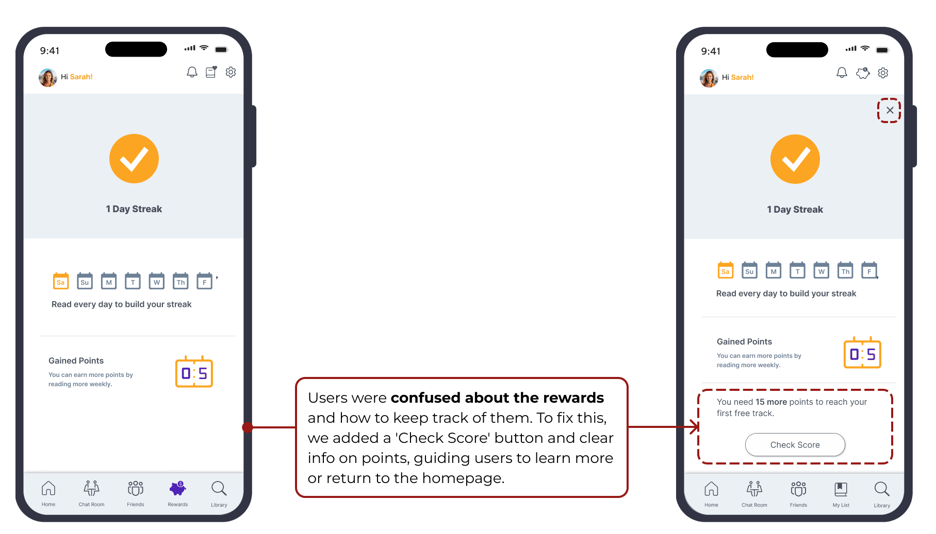
Prior to the usability test, users found the delay in page changes undesirable. Additionally, they were confused about the rewards and their usage. To address this, we incorporated information about points and rewards, guiding users to check their scores by adding " Check Score " button and learn more or to return to the homepage.


Before
After


After


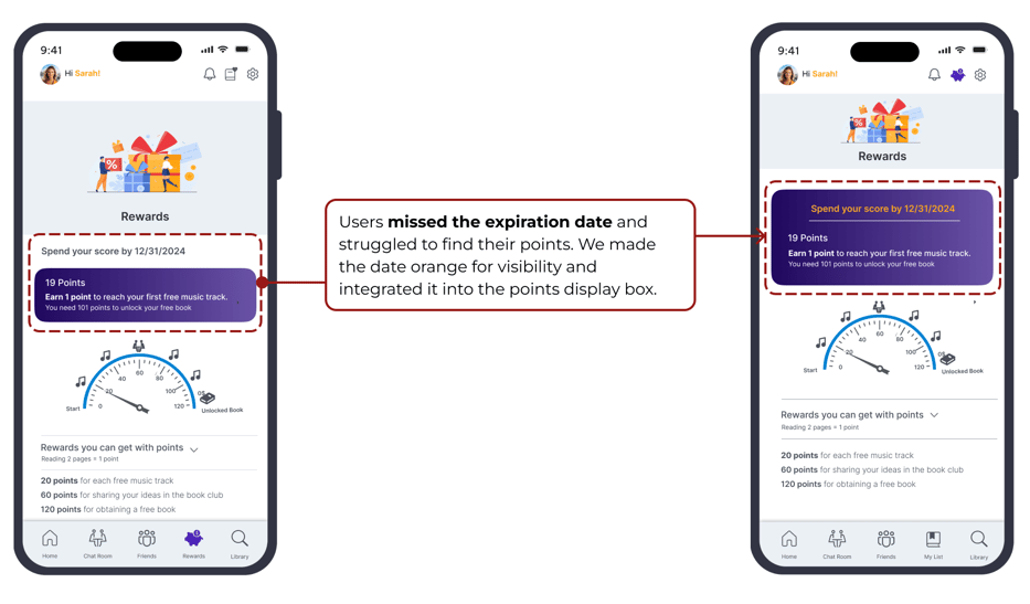
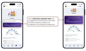
Before
Users often missed the expiration date and struggled to find information about their current points. To address this, we enhanced visibility by changing the color of the expiration date to orange, making it more noticeable, and integrated it into the box displaying users' point information.

Before
After


Users get confused with lots of pickers and book photos under them. To classify and simplify information, we change filter to a modal dialog with some pickers.


Delivered Design Pages


Prototype
Here is the final prototype, showcasing the results of our design process.
Next Steps
Focus on users and deliver simple solutions.
Social features like book clubs and sharing can boost community and engagement in the app.
Insights into users reading habits, such as reading frequency, session duration, and preferred devices.
Learned the importance of empathy in teamwork.
Successfully collaborated with a challenging team member.
Used UX test results to build trust and guide decisions.
Improve the app's accessibility features to ensure that it can be used by individuals with diverse abilities.
Evaluate the current design by doing more user experience testing.
Work on the app's social features such as book club and social sharing functionalities.
This journey taught me…
See more of my works:


NeighbourTools-Lending Task
UX | UI Designer
UX | UI Designer
UX | UI Designer