Reader City App
This app uses fun elements to motivate adults to read more books
Reader City uses a user-friendly e-commerce app to promote reading habits through gamification. Users earn points by hitting short reading milestones, redeemable for rewards like music tracks and extra books. The app makes reading accessible anytime, anywhere, overcoming focus challenges with enticing rewards, ultimately leading to free books.
Our team of four freelancers is committed to designing an app that turns your free moments into reading opportunities. We promote social connections for easier access to reading material and motivation from friends' activities. As UX designers, our main aim is to ensure users can navigate smoothly and set goals easily.

Duration
2 Months-Part time
Team
Group of 3
Tools
Figma, Figjam, Photoshop, Canva, google Form, Marvel
My Role
UX|UI Designer


Setting goals to achieve easy-win points.
Navigate a simple-to-use reading tracker to establish a routine.
Use notifications and breaks to enhance reading focus.
Connect users to share books and enhance social engagement.
Business Goals
Target
We're focused on engaging all people, particularly adults and eager social media users from Generation Z, by introducing them to the attractive world of books through our app.
Design Process


To understand how we can design an educational app to encourage users to use it regularly, we conduct surveys, interviews, and check out our competition.
Discover
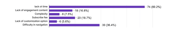
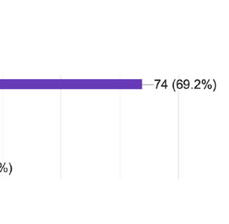
Our survey of 113 people helped shape the Reader City app, designed for fun and engagement. Key insights include: Literature review informs survey questions by identifying key themes and gaps in research.
Survey
What prevents you from using a reading app?
How do you select your book?
Takeaway
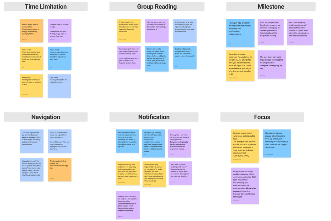
The main obstacle for using a reading app was time limitation.
Users encounter difficulty with navigation in reading apps.
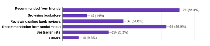
Friends can help in selecting books more easily.
Interview & Affinity Diagram
After the survey, we conducted semi-structured interviews with 15 participants to better understand their pain points.
Takeaway
Streamline the process of tracking users' reading progress.
Users often struggle with focus.
Group reading mentioned as one of the most motivating factors.
Comparative Analysis
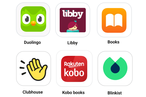
We studied 6 apps, including educational ones like Duolingo and communication apps like Clubhouse. We wanted to see what they do well and where they fall short. We examine various aspects of competing apps to gain comprehensive insights about their features and functionality, user experience flow, and content presentation and organization.
Filtering Feature Enhancement
Short-Term Goal Setting Integration
Reward System Based on Progress
Categorized Content Organization
Simplify social engagement by sharing books, chatting live, and connecting friends seamlessly.
Takeaway
Define
Persona
Based on the research we reached to a persona who is Sara Ketabi, 38 Years Old, Software Engineer, Baltimore, MD
She loves her job and reading, and manages computer-related pains by listening to audiobooks while driving and taking breaks with notifications to rest.


Storyboard
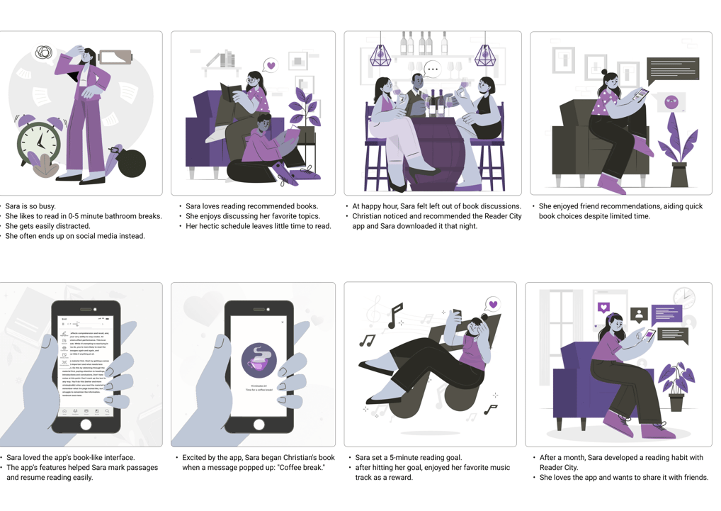
Based on our research, we created a persona: Sara Ketabi, 38 years old, a software engineer from Baltimore, MD. She is busy with her work and toddler. Sara loves reading but struggles to find time for it until she discovered Reader City and achieved her reading goals.
User Flow
Our user flow involved signing into the app, setting a goal, selecting desired content to read, and then reading the chosen book within the designated goal time.


Develop
To rapidly visualize the overall structure and layout of the ReaderCity app, we created these hand sketches. They enabled us to collaborate effectively and gather feedback from our team members.
Sketches & Wireframes


Utilize white and gray for readability and cleanliness, accentuated by pops of purple to highlight gaming and technology elements, and orange for notifications.
Mood Board


UI Design Direction
UI Kit


The contrast between the foreground and background colors of the primary and secondary buttons was tested on websites that evaluate color blindness, ensuring their acceptability.
Color Accessibility


Design Thinking
Challenge
Solution
Connect users to share books and enhance social engagement.
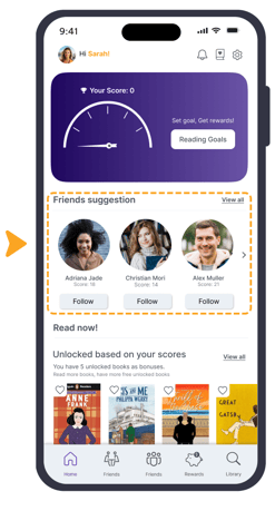
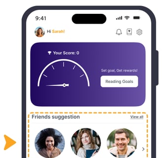
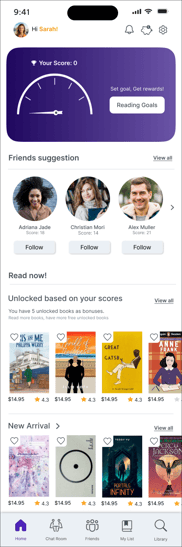
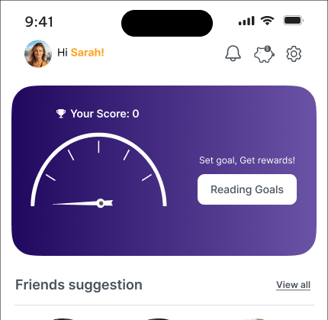
Adding a friend suggestion section under the hero image on the homepage. Additionally, adding a friends section to the bottom navigation bar.
Use customizable push notifications and breaks to enhance reading focus.
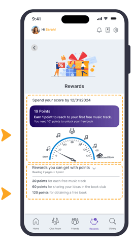
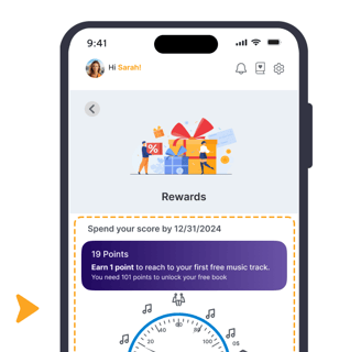
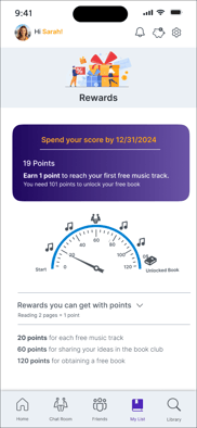
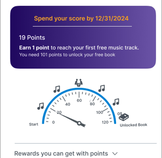
Emphasize rewards by placing them in the bottom navigation bar and displaying user rewards based on the tracking gauge on the rewards page.
Encourage users to develop a reading habit by rewarding reading.
Clearly explain the reward system based on reading progress or time spent on the pages.
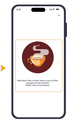
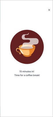
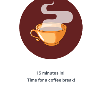
After reaching the specific break time defined in the settings, ReaderCity displays a message encouraging users to take a break, promoting healthy reading habits and preventing eye fatigue.
based on insights from our research and our understanding of the problem and user needs, we endeavored to develop user-centered solutions that not only address real user needs but also deliver a positive user experience.
With the assistance of mid-fidelity wireframes created in Marvel, we aim to clarify the functionality of ReaderCity, facilitate communication with stakeholders, and prepare the app for prototyping.
Mid-Fidelity


After creating mid-fidelity wireframes, we tested them with users to assess their effectiveness. Based on the results, we iterated on some parts as shown below:
Usability Test 1
After usability testing, we discovered that users had difficulty finding the appropriate feature in the top navigation bar because it was crowded and contained too many features. As a solution, we organized them into a dropdown menu.
Placing the goal in the settings dropdown menu made it difficult for users to find. Moreover, it was confusing for them. As a result, we moved it to the profile dropdown menu. Additionally, to reduce the time it takes to find it, we placed it in the hero space on the homepage.


Before
After
Before
After

By implementing the results from usability test 1, we created high-fidelity wireframes, which we then tested with users. Based on their feedback, we made revisions to certain sections, as illustrated below:
Usability Test 2
Users had difficulty finding 'My List'. Consequently, we relocated the Reward and 'My List' icons and removed "Go to My List" from the 'Opening Book Page'.
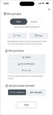
Users hesitated to tap the 'X' button, fearing they might lose their changes. To address this, we added a 'Save' button while keeping the 'X' to close the interface without applying changes.
Additionally, we implemented this page as a modal dialog to create temporary focus, encouraging users to set up their goals and break times.


Before
After
Before
After


Our users mostly expected to find "set break reminders" within the 'Set Goal' page, as they often enter focus mode there. To address this, we added a 'Set your Break Reminder' option to the top of the 'Settings' section on this page.


Prior to the usability test, users found the delay in page changes undesirable. Additionally, they were confused about the rewards and their usage. To address this, we incorporated information about points and rewards, guiding users to check their scores by adding " Check Score " button and learn more or to return to the homepage.


Before
After


After


Before
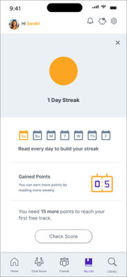
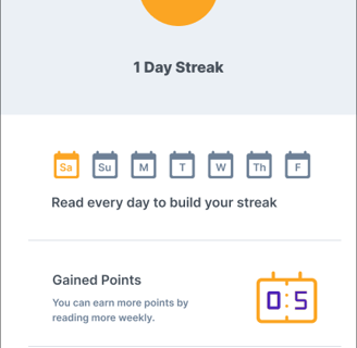
Users often missed the expiration date and struggled to find information about their current points. To address this, we enhanced visibility by changing the color of the expiration date to orange, making it more noticeable, and integrated it into the box displaying users' point information.

Before
After


Users get confused with lots of pickers and book photos under them. To classify and simplify information, we change filter to a modal dialog with some pickers.


Delivered
Delivered Design Pages


Delivered
Delivered Design Pages
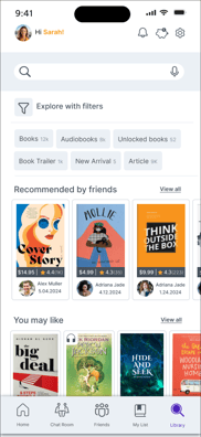
Home Page
Rewards Page
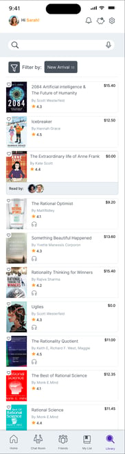
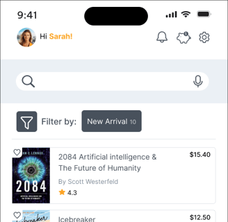
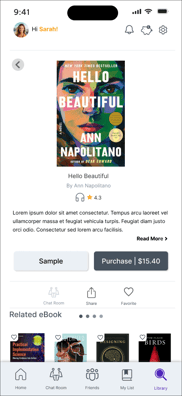
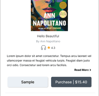
Set Goal Page
Search Page
Search result
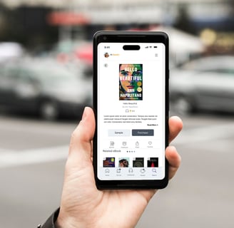
Book Description
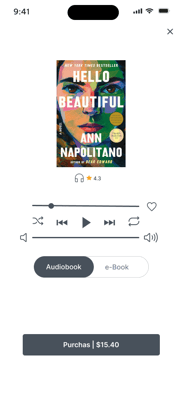
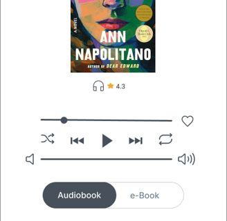
Play Audio Book
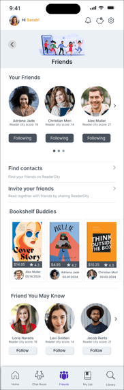
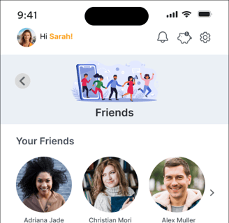
Friends Page
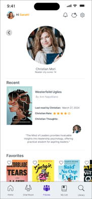
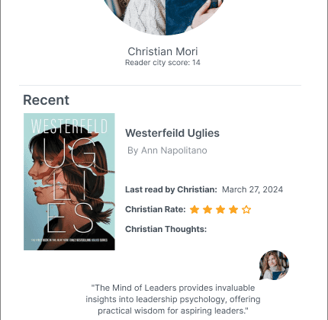
Christian Page
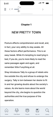
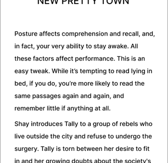
E-Book Page
Break time Reminder
Day Streak
Prototype
Here is the final prototype, showcasing the results of our design process.

Reflection
What did I learn?
Focus on users and deliver simple solutions.
Improve design thinking through iteration.
Work effectively in teams and meet deadlines.
Social features like book clubs and sharing can boost community and engagement in the app.
Insights into users reading habits, such as reading frequency, session duration, and preferred devices.
What can we do next?
Improve the app's accessibility features to ensure that it can be used by individuals with diverse abilities.
Evaluate the current design by doing more user experience testing.
Work on the app's social features such as book club and social sharing functionalities.