NeighborTools
Lending Case Study
NeighborTools is a peer-to-peer platform that facilitates the lending and borrowing of tools. The project was executed in two phases, with the lending flow—which I focus on here—being the second phase.

Duration
6 Weeks
Team
Group of 3
Tools
Figma
Photoshop
Canva
google Form
My Role
UX|UI Designer
In the lending flow section of NeighborTools, we address the complementary aspect of our platform's functionality: adding items for renting. This phase builds upon our initial goals to enhance user engagement and satisfaction, ensuring seamless transactions and community building through efficient tool lending practices.
Key Contribution
User Research
Concept Ideation
Wireframing
Interaction Design
Prototyping
Useability Testing
Project Vision
In the lending flow section of NeighborTools, we address the complementary aspect of our platform's functionality. This phase builds upon our initial goals to enhance user engagement and satisfaction, ensuring seamless transactions and community building through efficient tool lending practices.
Duration
Oct 2023 - Jan 2024
Team
Group of 3
Tools
Figma, Figjam, Photoshop & Canva, google Form
My Role
UX Research, UX Design, Interaction Design, Useability Testing
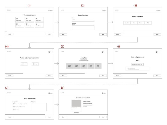
Final Prototype
THE SOLUTION
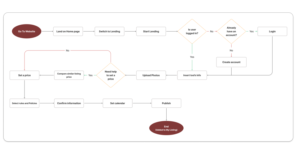
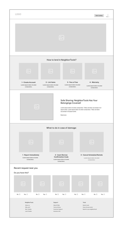
In the video below, you can see the user flow for adding a tool on NeighborTools.

Discover
To understand users and problems, the following steps has been taken
Interviews
Competitive analyses
Surveys
Interview
In a semi-structured interview with a group of 8 individuals, we endeavored to explore their willingness to lend their spare tools. To find the interviewees I posted in our neighborhood Facebook group and asked if people are interested to do the interview. My objective was to identifying their pain points and concerns in this process by delving into their past experiences and apprehensions regarding lending.
Takeaway
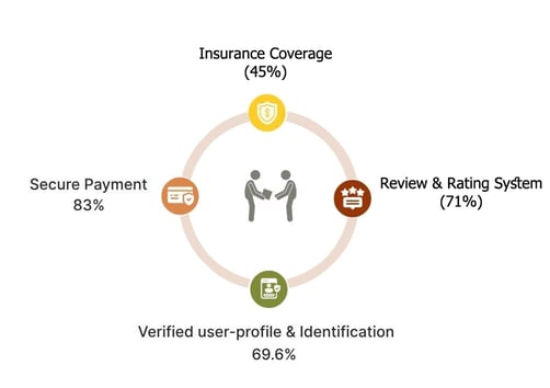
Key Features for lenders were:
Insurance/security deposit
Secure payment
Verified user-profile & identification
Borrowers’ reviews & rating system
Survey
Following the interviews and competitive analysis results, we conducted an online survey consisting of six questions to assess our findings. We gathered a total of 102 responses, with 70% falling within the age range of 35 to 44.
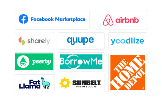
Competitive Analysis
We analyzed platforms like Facebook Marketplace and Airbnb, along with eight others, to enhance our product's user experience. Drawing insights from their information architecture and user flow, we implemented improvements in our own platform.
Top Takeaway
Neighbortools needs to highlight features like price suggestions in listing tool, showing earnings in user profiles, and confirming tools before deducting money.
Also we found out how to present the features and have a seamless and smooth lending tool journey.
Takeaway
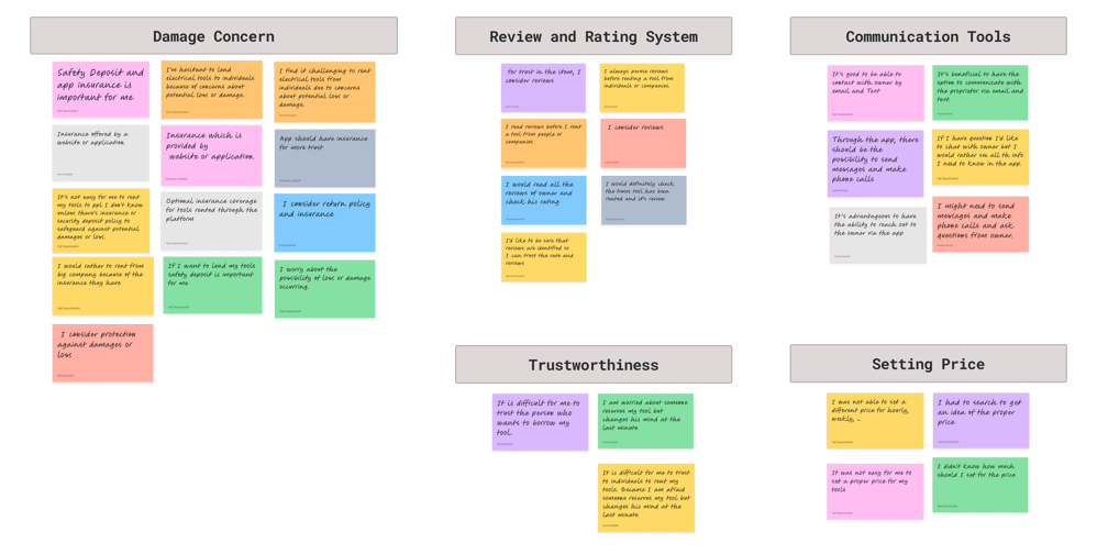
Concern about the potential loss or damage of the tool.
Concerns about fraud and trustworthiness.
Facilitate communication between owner and borrower for any arrangement.
Determining appropriate pricing.
From the survey and interview we learned about the behavior and concern of our users and it became clear that presenting business features effectively and flawlessly is a top priority as users were concerned about it.
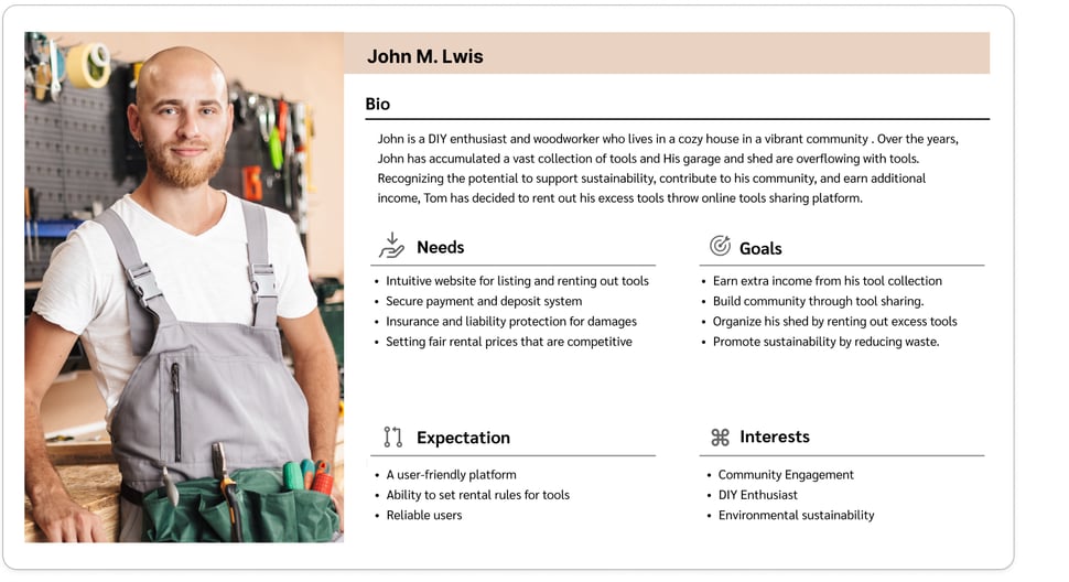
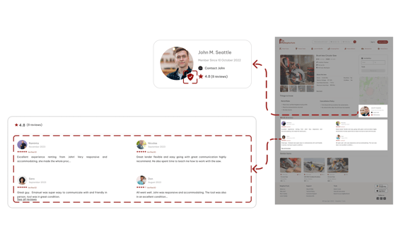
Based on our research, we identified a user persona for lending from NeighborTools: John M. Seattle, who lives in a larger house and values community support, as well as earning money from their unused tools.
Define
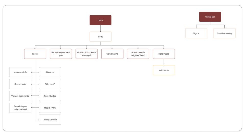
Site Map
Persona
By doing card sorting, we learned how to organize different sections of our web site and we made first version of our site map. However through out the design process, user testing and the competitive analysis, the final version of the site map was build.
User Flow
Develop
Uncertainty regarding Insurance and tool protection against potential damage or loss for owner.
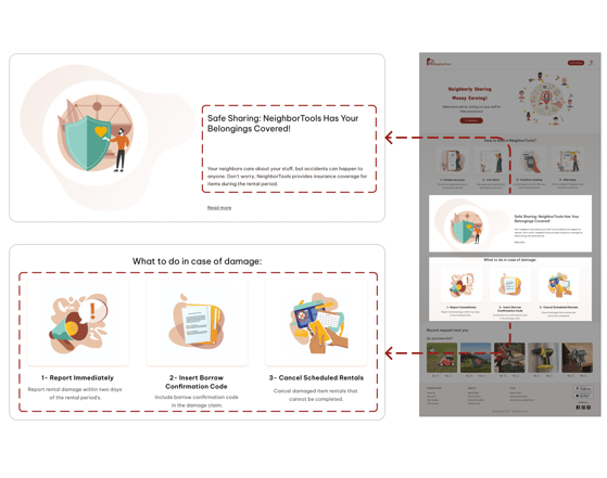
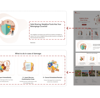
Dedicate a section on the first page of our platform to highlight all insurance and item protection information .
Challenges
Solutions
Concern regarding fraudulent activity and trustworthiness.
Owners faced uncertainty in determining the appropriate pricing for their rentals.
Dedicate a section on the first page of our platform to highlight all the information regarding safety and Identity Verification.
Dedicating a section to Showcasing Users Reviews in User's profile page.
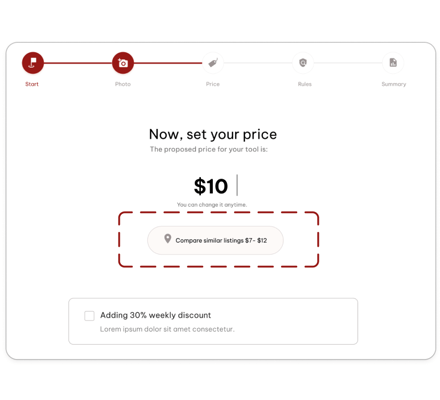
After discussion with our stakeholders, decided to add a "Compare Similar Listings" feature. This way, owners can easily check how their pricing compares to similar listings on the platform, helping them make better decisions.

Implement a section on the first page of our platform showcasing procedures for what to do in case of damage.
Verified accounts are indicated by an icon next to the user's profile picture.

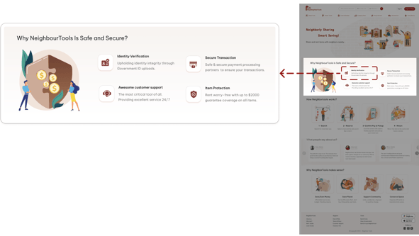

After thoroughly researching and understanding our users' needs and problems, we brainstormed solutions to address their concerns in our design. Here are the options we've come up with:
1
2
3
Challenge & Solutions
Develop
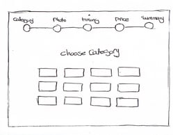
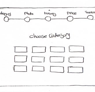
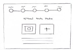
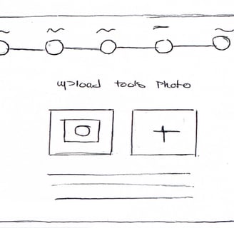
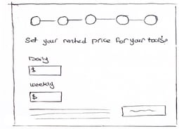
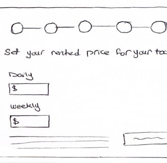
Sketches & Wire Framing
We created low-fidelity wireframes by hand sketching to map out our Ideation which helped us in the early stages of the design to go forward and have better communication with the team.
Mid-Fidelity
We created Mid-fidelity wireframes on Figma to map out page layouts design vision. The wireframes went through a couple of rounds of iteration before the final content was developed.
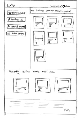
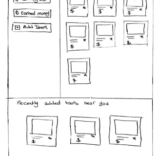
Low-Fidelity

Home Page
Listing Item Wizard
Usability Test (phase 1)
What did our users think about our design?
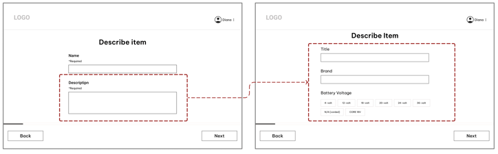
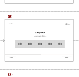
"Listing Item Page"
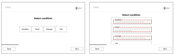
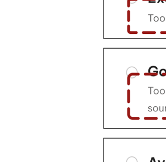
We recognized that users had difficulty in distinguishing between different conditions. To simplify this process, We added short descriptions for each condition to help users easily select the right one for their tool.
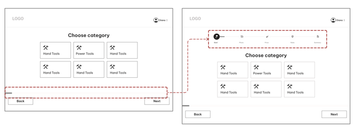
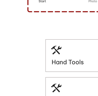
Users prefer clarity on the next steps in the listing tool process. To enhance this, we're now displaying the steps at the top instead of using a progress bar.
Users had difficulty in writing accurate information about the tool. We've streamlined the tool's information input process by offering tailored suggestions based on the selected category.
Before
After
Before
Before
After
After
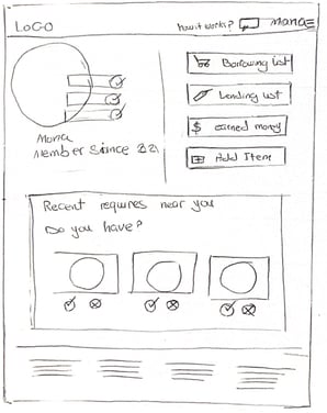
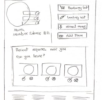
Profile
Profile -Lending
Listing Item Wizard
After diving deep into all our research data and understanding users' needs and problems, we endeavored to figure out how we could respond to their concerns and address them by incorporating a solution into our design. Here are the possible solutions we came up with:
Deliver
UI Design
"In crafting a high-fidelity interface for NeighbourTools, we begin by crafting a mood board that mirrors the primary objectives and desired emotions identified by stakeholders. This initial step aids us in setting the visual tone and overall style for the interface.
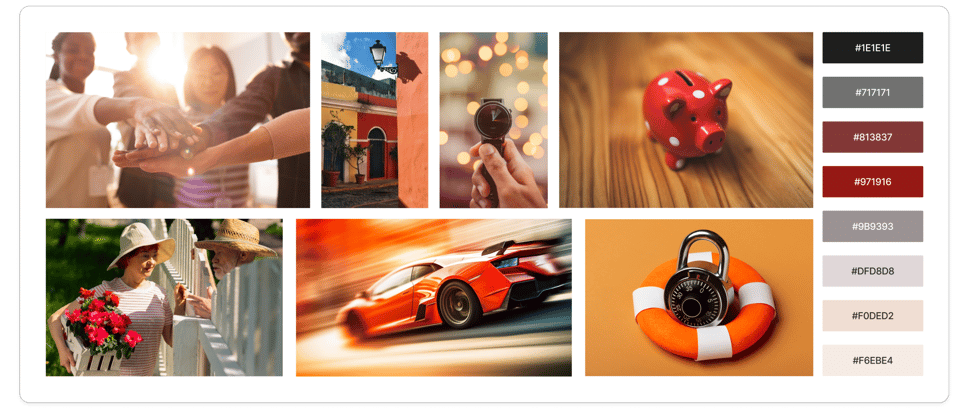
Mood Board
UI Kit
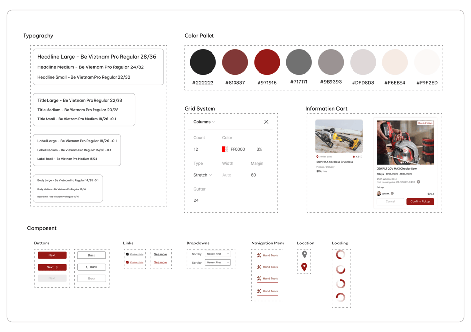

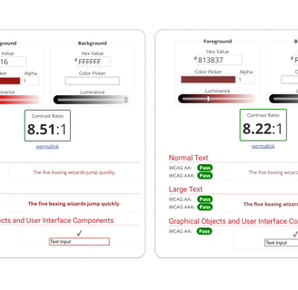
The contrast between the foreground and background colors of the primary and secondary buttons was tested on websites that test color blindness, to ensure its acceptableness.
Color Accessibility
Usability Test (Phase 2)
Before
After
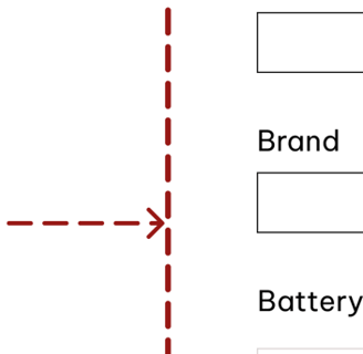
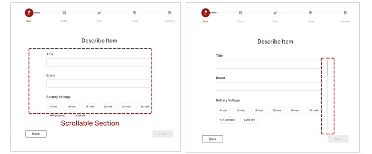
In response to user feedback, we've introduced a scroll bar in the 'Describe Item' section to enhance the visibility of inputs within the scroll.
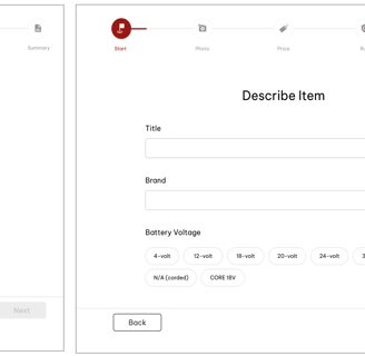
Listing Item Page
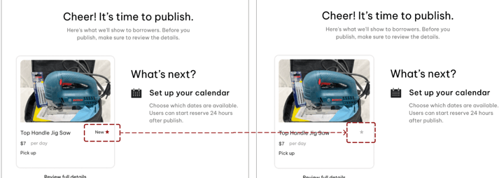

Users mistook the word "New" as indicating the condition of the tool in the last step of listing an item. To clear up confusion, we removed 'New' and changed the star for unrated items to grey.
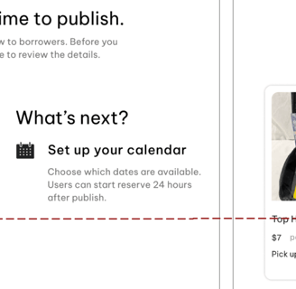
After listing an item, users were confused about their location. To address this, we've added a title to the page.
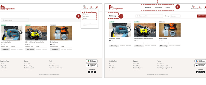
My Listing Page
Also to facilitate navigation between listings, reservations, and other sections, we've added a navigation bar.
Delivered Design Pages


After
Before
Before
After


Home Page
Listing Item Wizard
Inbox
My Listing
Reservation List
Create Account
Reflection
What did I learn?
Effective communication with team members and lead challenging situations
When designing, it's important to strike a balance between meeting users' needs and aligning with stakeholders' marketing strategies.
The project taught me a valuable lesson: instead of fixating on being right from the start, it's more crucial to embrace the iterative learning process and adapt as you go along.
What can we do next?
Finalizing the mobile version of platform.
Evaluate the current design by doing more user experience testing.
Think about the solution for the time when it comes to tools becoming outdated or less utilized over time.
Enable owner-managed shipping options, implement a transparent fee structure for delivery services, and optimize payment processing to enhance user convenience and financial clarity on Neighbortools.
Change the list item to begin with uploading photos. The app will then suggest a bunch of related categories. Based on the selected category, additional boxes will pop out asking for more information.


